Liexuan Zhang's Blog
I am a student in the MA Digital Media programme, you can call me Lucas, and this website will be used to document my weekly reflections on digital practice.
I am a student in the MA Digital Media programme, you can call me Lucas, and this website will be used to document my weekly reflections on digital practice.
It doesn't seem like I'm learning anything new, but I've realised that there are 4 Assessments for this module, which is making me feel a bit anxious. Also, my girlfriend asked me to make a European travel plan for reading week, but I suddenly realised that there is no reading week at the Uni of Leeds. 😡
To be honest, I actually wrote this part in week three. The very beginning of learning to build a website using html actually went pretty well, except for the fact that I downloaded the wrong Filezella server. When I got home I became dissatisfied with the simple code and ugly web design, so I found some online tutorials and tried to make the site look fancier. However, things went horribly wrong from there, as my site turned into a bunch of gibberish, and my attempts to fix the problem were only able to turn my page from gibberish to an ugly site with 29 unloadable photos.
Things are finally getting better, the html templet is a real blessing and my site looks much better. But the process still exposed some of my current problems, for example, the inserted images may look very strange because of the proportion, I guess it has something to do with CSS, so I still need to look into it further. Oh yeah, in this week's workshop we learnt about collecting online data using an online data scraper, which was a bit easier for me as I learnt similar data collection methods and data visualisation methods in my undergraduate studies and applied them to my assessment. But the hilarious thing is that I forgot what that data visualisation tool was called.
Maybe next week I should look into adding a button under the weekly content that can link to another site so I can include some relevant screenshots and some more detail.

I've given up on adding hyperlinks to my interface, not because of technical problems, but because the process of creating a new html file and connecting to a FileZilla server can be tedious.
Beyond that, because of the interruption of the fire alarm and the fact that the research direction our group chose didn't seem to require the use of a scraper to collect online data, I chose a topic of interest to me and used a scraper to collect some online data.
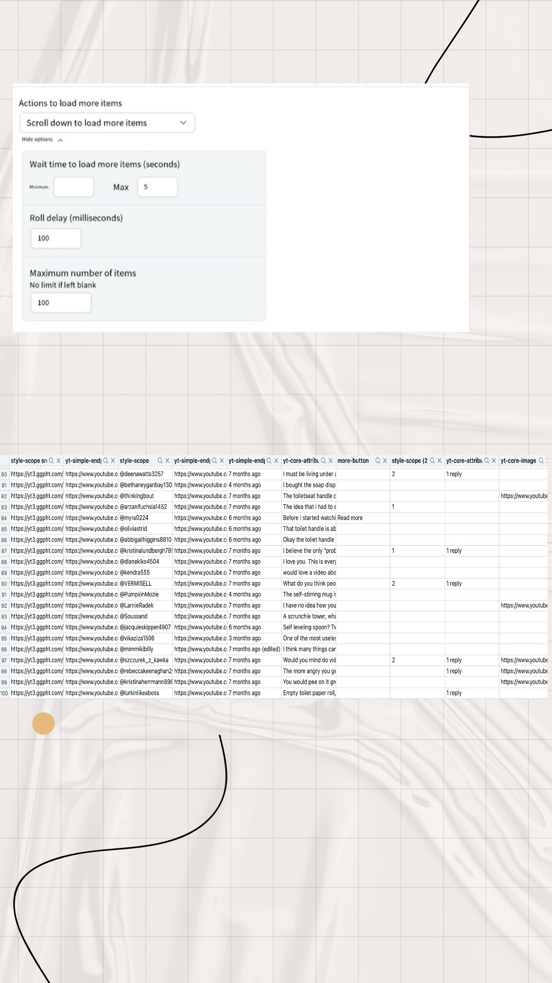
Firstly, I found a YouTube video titled ‘ANTI-HAUL // 15 things I won't be buying in 2024’, which was about a blogger sharing some of the consumer pitfalls of online shopping, and warns viewers not to buy these things that seem useful but are completely useless and of poor quality. I was interested in the viewers' comments, so I used an online data scraper to collect this information. Even though I have limited the maximum number of data collected to 100, I found that the non-visualised datasets (i.e. csv and json formats) were very difficult to read.
I hate the flu! It's just so unpleasant.
The main difficulty I've had so far is that many of the digital scrapers mentioned on workshop won't install on my MAC, some are system incompatible while others require payment. But luckily I found a plugin called ‘Easy Scraper’ and I'm happy with it so far 😁.
Also, I found that the data collected by the data scraper seems to contain some content that I don't need, and I tried to solve this problem, but to no avail. It seems I can only manually filter and delete this useless information.
Here are my reflections on the key reading for week 5. For the dissemination of complex information, data visualisation can distil large amounts of data into a more accessible visual form, allowing audiences to grasp complex information quickly and intuitively. Furthermore, at the level of influencing perception, data visualisations can shape the way data is perceived and interpreted. They can highlight certain aspects of the data while downplaying others, thereby influencing the audience's understanding and perspective. Effective visualisations can therefore engage audiences and increase data transparency, making them valuable tools for advocacy and social justice. They can help convey important messages and mobilise support for social movements. For example, after I recently saw some statistical visualisations of data on cancer cases caused by smoking, I became frightened and determined to quit smoking. However, there may also be limitations to the information that can be conveyed by data visualisations, namely subjectivity and bias. In other words, the design choices made when creating visualisations can introduce bias as they reflect the priorities and perspectives of the creator. This can lead to misinterpretation or distorted representations of the data. And the difficulty in representing data that is complex can be significant; although visualisations are intended to simplify data, they can still be complex and may not clearly communicate the intended message to all audiences. Different audiences may interpret the same visualisation in different ways, leading to confusion or misrepresentation. Yet in their efforts to make data easy to understand, technicians may perhaps oversimplify that data, thereby ignoring important nuances and context. This oversimplification can lead to a lack of depth in the understanding of the data and its implications.

I wanted to try to visualise the dataset (comments on YouTube videos) I collected last week, but I quickly realised it wasn't a good idea after seeing the four data visualisation tools listed by Holly. I found it really difficult to visualise this type of data, which is made up of one or many sentences. It's also tricky to classify text-based data. For example, in addition to comments that can be simply classified as 'agree' and 'disagree', there are also lots of contradictory 'partially agree or disagree' and other comments that don't involve agreement or disagreement.
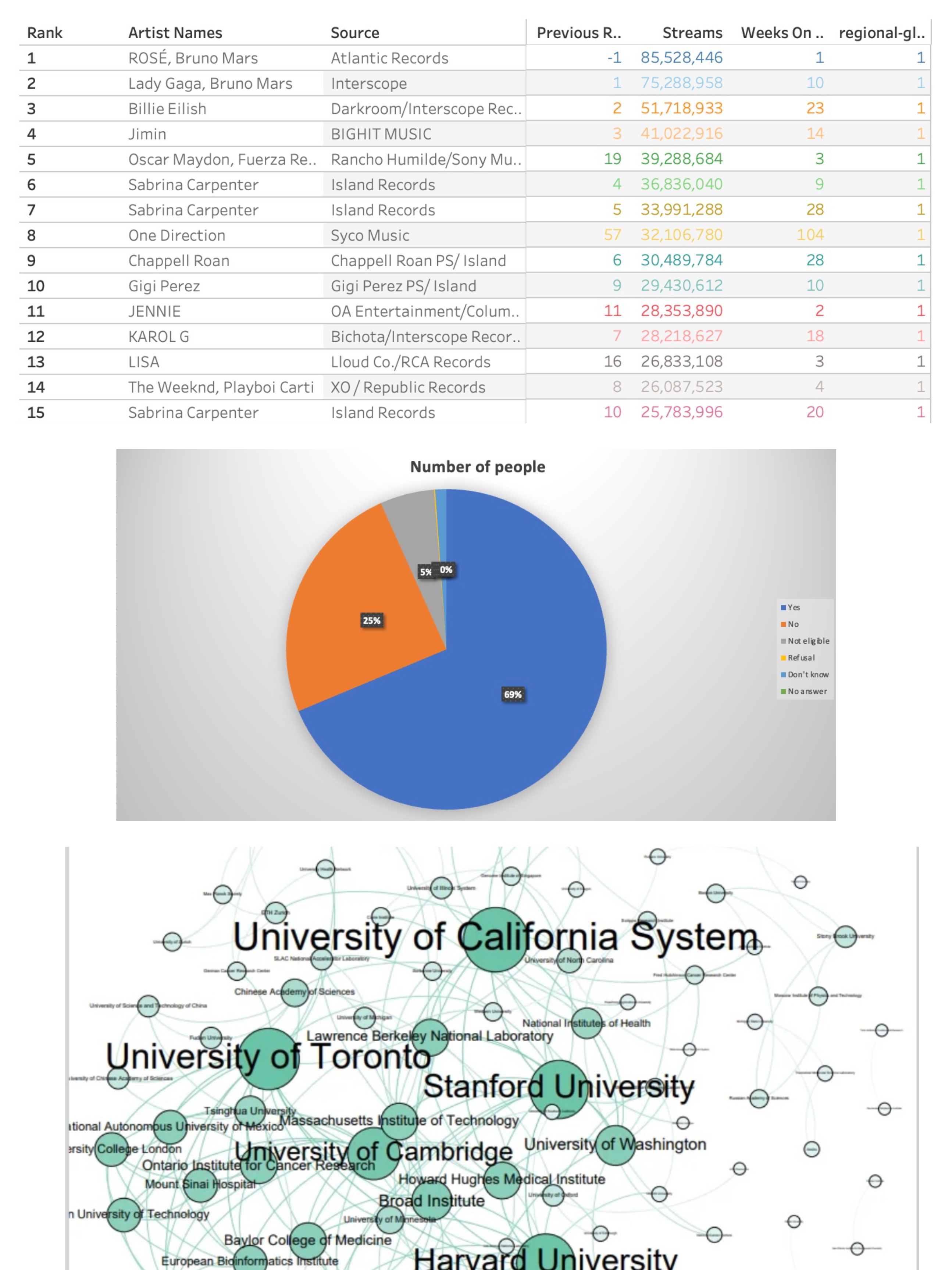
So, using the dataset provided by Holly, I made my first simple attempt using Excel. I found that the built-in data visualisation plug-in in Excel only seems to be able to handle relatively simple datasets, but that doesn't mean it's not useful. On the contrary, when dealing with these simple data levels, as long as each step you take can provide reasonable constraints for the data visualisation, Excel can generate various charts quickly and accurately. Then I remembered my undergraduate experience of using Gephi for data visualisation. Gephi helps us intuitively understand the connections between individuals in the data by representing nodes as individuals or entities in the data and edges as their relationships. We can also use Gephi to perform centrality analysis to identify key nodes and key intermediaries in the network. Personally, I have used it to show the correlation between documents and the link between web pages. However, I have found that when using Gephi for data visualisation, we need to carefully consider the colour selection of the nodes, as the shade of colour may represent the type of data or centrality. The colours of some sub-data with high similarity are very close to each other, which may be difficult for colour-blind or colour-impaired users to distinguish. Secondly, if the reader does not have the relevant knowledge, they may not be able to understand the data expressed in the image at all. Finally, I have tried using Tableau and although I am currently limited to using very few of the free features, I am still amazed at the power of the tool. In particular, after reviewing the Spotify music trends case provided by Holly, I think that with the same level of technical expertise, Tableau could produce relatively more perfect charts. It suddenly dawned on me that when choosing a data visualisation tool, we need to first consider who our ultimate audience is. In other words, technical staff need to consider the ability of the target audience to read the information. Secondly, we need to consider the complexity of the data and the form in which we want to present the data to the audience. In my current experience, no single data visualisation tool is perfect, i.e. each tool has its own strengths in terms of presentation. Technical staff need to choose the right tool for their needs.
I really hate the flu. I feel like I'm in the weakest state I've been in for over 20 years (except during a pandemic.).
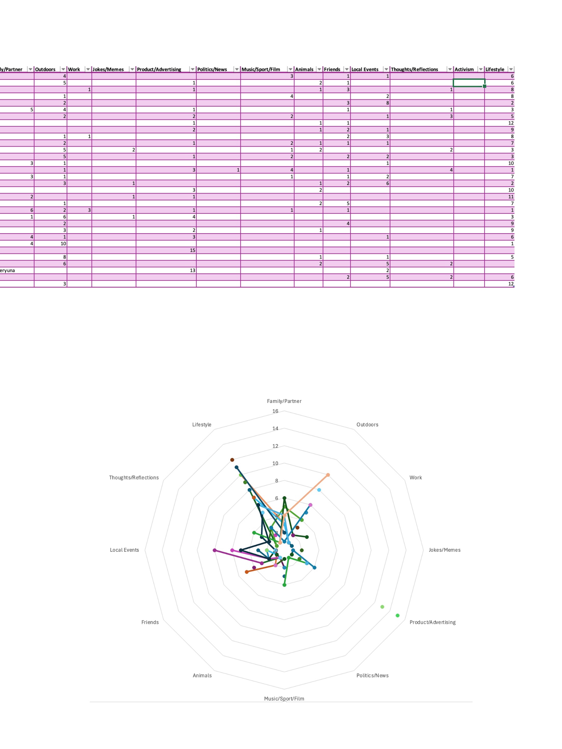
This week's TASK confused me a lot. I visited 32 friends' Instagram homepages and used 15 of their latest posts as a source of data. And I was asked to categorise this data based on the 13 categories given and each post could not be categorised twice. This really confused me as the types of posts were really very difficult to define. After a few attempts I gave up on the categorisation job temporarily and instead started with a general overview of all the data content. I found that the attributes of each single piece of data could be classified into three types, photos with text, photos without text, and videos. After that I started defining the 12 categories(I deleted 1 category because I couldn't find anything that could be categorised as ‘Activism’)as detailed below:
1. ‘Family/partner’: photos or videos containing family members or partners fall into this category, regardless of the background of the photo. 2. ‘Outdoors’: photos or videos of outdoor scenery, which may not contain the account owner himself but can contain some passers-by, and the content theme can only be scenery. 3. ‘Work’: media content for the account owner's work scene and words, such as wearing work clothes or in the company, promotional content does not belong to this category. 4. ‘Jokes/memes ‘: no need to explain too much here, because this classification is easy to identify. 5. ‘Product/advertising: content that promotes one's own products and also includes media content that mentions other merchants or products. For example, restaurant or hotel visiting content.6. ‘Politics/news’: no explanation needed.7. ‘Music/sport/film’: no explanation needed.8. ’ Animals": any content containing any non-human animal is preferred. 9. “Friends” any scene containing a photo of the account owner and his/her friends is preferred. 10. ’Local Events": any large gathering or festival such as a concert, New Year's fair, etc. However, any scene that includes promotions, pets, friends, or any other content that is not included in this category will be given priority. However, media content containing selfies, promotions, pets, friends, family, mates, political marches, etc. do not belong to this category. 11. ‘Thoughts/reflections’: text-driven post content and must be the account owner's feelings about something, such as trolling, emotional outbursts, and reflections and summaries of a certain phase of life, but does not contain comments on political events or news content. 12. ‘Lifestyle’: selfies of the account owner alone in any scenario are preferentially categorised as this.
After summarising and analysing these sort of data, it seems that I can make a rough sense of the online identities of these 32 people. In other words, I can get a brief understanding of these 32 people's daily lives, interests and preferences, social behaviours, etc. based on these data after classification.
Special Collections Field Trip
To be honest, this week's Special Collections Field Trip has made me feel an unprecedented challenge. Especially when I learned that these old papers, which I regarded as oracle bones in my eyes, would be related to my subsequent assessments.
Reading the Quarry Hill Unhealthy Area reference book and the Knaresborough Workhouse Daybook gave me an intimate glimpse into past living conditions and social inequalities in Yorkshire. These documents revealed not only economic hardships but also the policies and social structures that shaped people’s lives. Furthermore, the documents involving the identity information of child laborers also aroused my complex emotions. This prompted me to reflect on whether collecting such information is in line with moral standards. However, from another perspective, in order to effectively enforce the current laws and regulations, maintain the factory's rules and regulations, and even protect the rights and interests of child laborers, these pieces of information seem indispensable. This issue involves numerous factors, leaving me perplexed.
However, I must admit that language and cultural barriers do exist. First, deciphering old handwriting and terminology was difficult, as many records were written in outdated English with unfamiliar phrasing. Additionally, as someone unfamiliar with the region’s local history, I sometimes struggled to fully grasp the historical context. Another challenge was access—some records were fragile or restricted, requiring careful handling and patience.

Last week's workshop gave us an intensive understanding and immersive experience of historical reconstruction. But at the same time, I had conflicting emotions.
First, we tried to recreate the historical scene based on the data in the “Quarry Hill unhealthy area, 1900: book of reference” and the historical photos we searched for. This was not to reveal absolute truth, but to construct a historical narrative with a basis in evidence. This echoes Fickers' view that history is about interpretation rather than revealing objective truth.
Through this process, I learned more about how historical narratives are formed. Piecing together a story from archival materials requires careful consideration of the choice of sources, context and interpretation. A key challenge is to ensure that our reconstruction is not unduly influenced by modern biases or assumptions. The concept of “layered material” also became important when we worked with digital versions of historical sources. We had to acknowledge that while digital resources are convenient, their existence depends on technological frameworks, which in turn determine their usability and meaning.
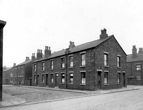
Another key issue is the authenticity of historical reconstructions. While digitization has improved accessibility, it also poses risks such as the loss of original context and the potential manipulation of sources. This got me thinking about the way digital history is constructed and the moral responsibility of historians to maintain the integrity of the data. And whether it is ethical for us to use this data to compile interesting or funny stories, because we seem to have not taken into account the tragic historical background when the data was recorded. That is, Quarry Hill was made up of low-quality back-to-back housing and courtyard housing, with narrow streets and poor air circulation. The houses often did not have running water, sewers or sanitation facilities. The residents were mainly low-income groups such as factory workers, coal miners, and textile workers. Due to overcrowded housing and outdated sewage systems, diseases such as cholera, tuberculosis, and typhoid frequently outbreak here.
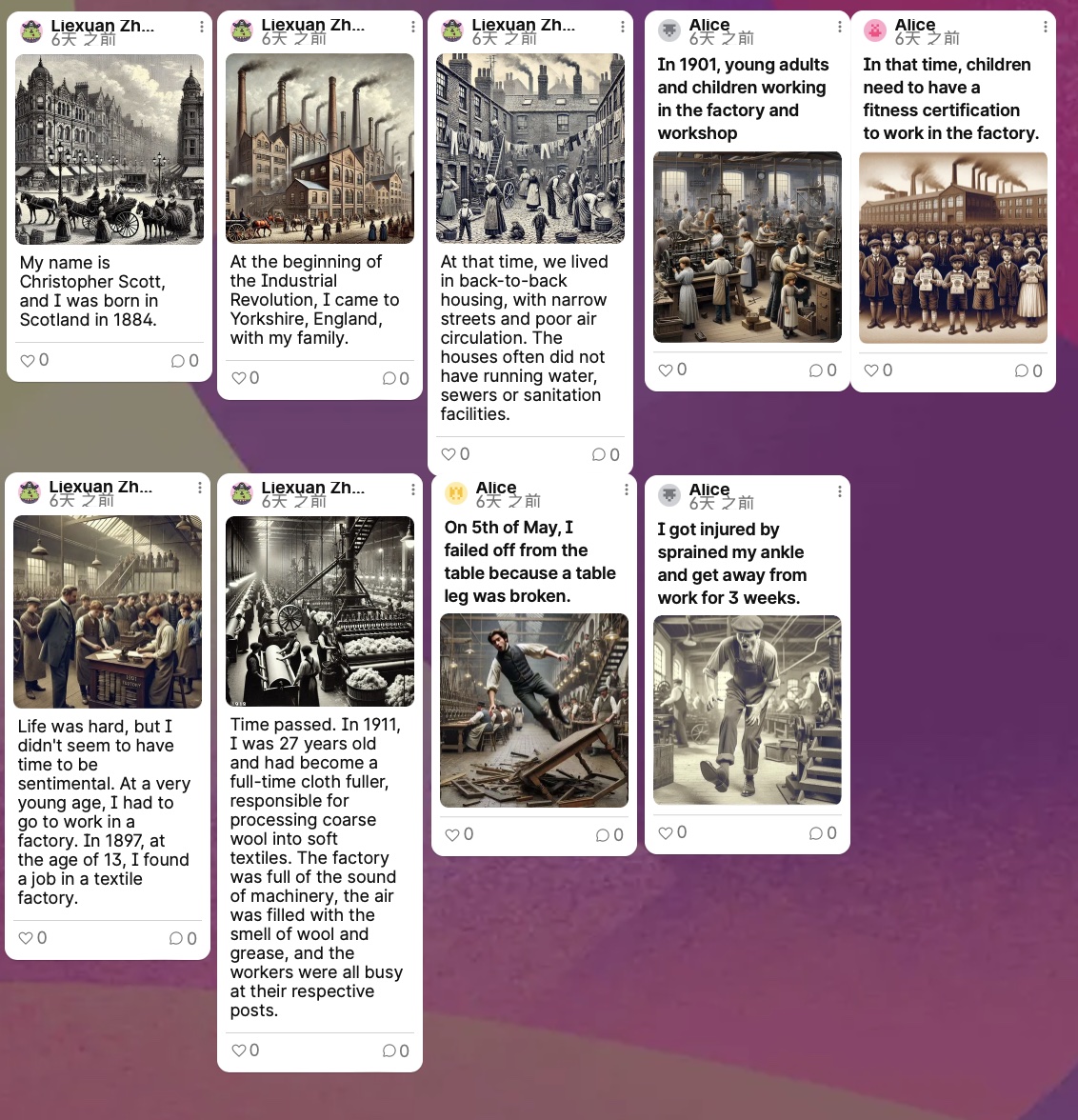
This week, our group worked with historical archives, extracting identifiable information and using it to craft a story.
Our first attempt was to use an OCR tool to extract text from historical documents. Unfortunately, the free OCR tool we tried struggled to recognise handwritten text in images – which, ironically, turned out to be the most crucial part of the information for us. That said, we did manage to find some legible details.
The data we uncovered were from a factory accident report. The injured worker was named Christopher Scott, a male Cloth Fuller, who was hurt on 5th May 1911 at the age of 27. The report stated that he fell to the ground from a wooden table while stacking fabric. This was the extent of the information we could extract from the archive.
However, we wanted to go further. Using historical context, social customs, and records from the same period relating to child labour and workers’ housing, we reconstructed Christopher’s life before this accident. We imagined that he might have been born in Scotland, moved with his family to Yorkshire during the Industrial Revolution, lived in back-to-back housing, and started working in a factory at the age of thirteen to support himself. This process of creating a narrative based on limited historical data made me reflect on the gaps in historical records and the cultural barriers that might lead to misinterpretations or over-extrapolations of the available information.
Another interesting aspect of this project was our use of CoPilot to generate images that complemented the story. This experience made me realise how AI-generated visuals can seem convincing to us but may be highly inaccurate in terms of historical reality. I also discovered that to produce more historically reasonable images, we needed to provide clear and precise prompts to CoPilot. Otherwise, it would generate completely unrealistic depictions – for example, if we didn’t specify the factory setting, it might portray a well-groomed Cloth Fuller in an immaculately clean, library-like textile mill, falling from an ornately crafted wooden desk. This entire process has highlighted the importance of historical accuracy and the challenges of working with both archives and AI-generated content. It’s made me more aware of how easily modern tools can distort the past – and how careful we need to be when using them.
Here are some of the works we have done, including design, data visualisation and reflections.